Co-founding Merkato app – road from idea to MVP to first 10k users(and 1M total items value).
Summary
We created a marketplace app.
In just two months, we went from idea to launched MVP app, with real users testing it and proving our core value proposition.
We used a lean development process to release updates in 2-week sprints.
We brought the first 10k users.
We grew the marketplace platform to 1M in total items value.
My Role
Co-founder
Product Strategy
Product Vision
GTM strategy Head of design
Art Direction
Branding
Growth Design
Results
MVP launched in 2 months: From concept to live product with real users
10,000 active users acquired: Built initial user base and community
1M marketplace inventory value: Total value of listed items on platform
Proven market demand: 63% of users posted multiple items, confirming our core value proposition worked
Established agile development cycle: 2-week sprint cadence for continuous improvement
Key competitive advantage: identified speed of listing creation as our differentiator in the marketplace
Comprehensive user data: gathered full journey metrics from acquisition costs through retention rates
The Idea was born. You’ve probably experienced it before…
It’s quite uncommon for 3 people to come up with the same idea in the same week, but that actually happened, and I’m going to tell you the story of how it started.
A few phone calls, a few chats, and we were pumped! You know how it goes—you’ve probably experienced it before.
You think about an idea and you are really excited about it.
You get the dopamine & endorphins flowing in your bloodstream when you talk about it with your friends and they share the same vision.
Coincidence? I don’t think so! 😉
You wake up the next day (and the next day….), and the idea is still there, and it still sounds reasonable. Ok, let’s do it!
The team – our roles
“With Great Power Comes Great Responsibility…”
Ben Parker, the Spiderman
Each of us had expertise in our field. The combination of our skills made us self-sufficient and the project sustainable in the long run.
Strategic decisions were made always together, and each of us had freedom & our own responsibilities in our respective areas.
At a high level, we had the same vision & drive for the project.
Research, do your homework first!
“Give me six hours to chop down a tree and I will spend the first four sharpening the axe”
Abraham Lincoln
We conducted research to better understand and learn more about the field.
We collected a lot of data, extracted insights, and benchmarks.
We took deep dives into this subject from the angle of each field (business, technology, design).
From a high-level perspective, during that stage we found answers for the following questions:
Target audience: For whom are we solving the problem?
Market: How big is the problem we are trying to solve?
Competition: Are there other products that are already solving it?
Product: How are they solving the problem?
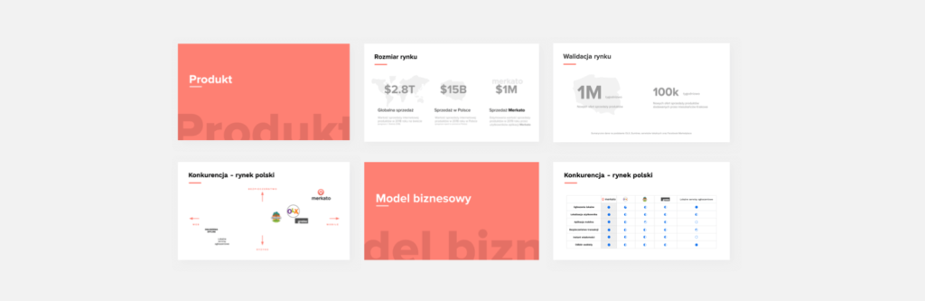
Many findings from this stage were added to the pitch deck that was created months later.
Slides from the pitch deck
The bird’s-eye view of the solution – the backstory
Personally I’m a huge sci-fi fan.
In the “Eva” (2011) movie, Daniel Brühl is playing a genius who was employed by his former university to design AI for robots. There is a scene when he is at home in his workshop.
He has this really cool tool to design AI.
Think about it as LEGO bricks + visual programming language + fully interactive holograms + gesture UI.
In an instant, he is able to zoom out and see the bird’s-eye perspective of his project.
And zoom in to see the tiniest details…
He can see how different systems are working together. Everything is interactive & interconnected. He can change each module, he can play with it the way he likes.
User story mapping for me is what this design tool is for the main character from the “Eva” movie.
Sure it’s a little different—two-dimensional and not so interactive and high-tech.
Instead of holograms, there are sticky notes and instead of gesture UI, there are pens and pencils, but it’s just a great tool to envision new ideas and explore their dynamics.
PS. If you are working on an interactive hologram version, please contact me right away! I am your perfect early adopter!
Clarifying the MVP idea – User story mapping
I always see value in doing user story mapping.
It’s built from the user perspective. Every feature, every interaction is built on top of the user journey.
It helps everybody get on the same page. It fosters discussions and helps to get the same understanding about high-level features & every little detail.
It’s great for MVP & lean development. Based on it you can craft your first release, first version of your idea. It’s a reference during each of your next iterations.
It’s great for most projects. Personally, I believe it’s useful 90% of the time. It’s a design tool that you can use whether you are creating a new app or planning your 1-month trip through Southeast Asia.
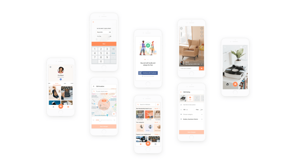
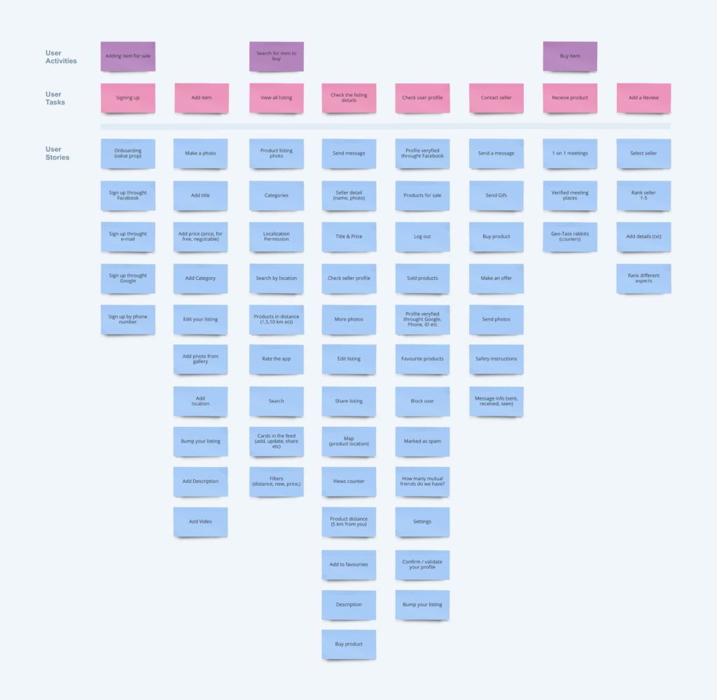
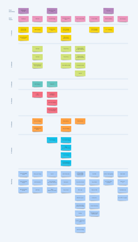
Below you can see the user story map of our app.
All user stories – User story map of our app.
MVP – The way we crafted first release
“If You’re Not Embarrassed By The First Version Of Your Product, You’ve Launched Too Late”
Reid Hoffman
We distilled the experience down to the core functionality – core value proposition.
If you think about Dave McClure’s AARRR! framework, we were able to get a grasp of the funnel from Acquisition to Retention.
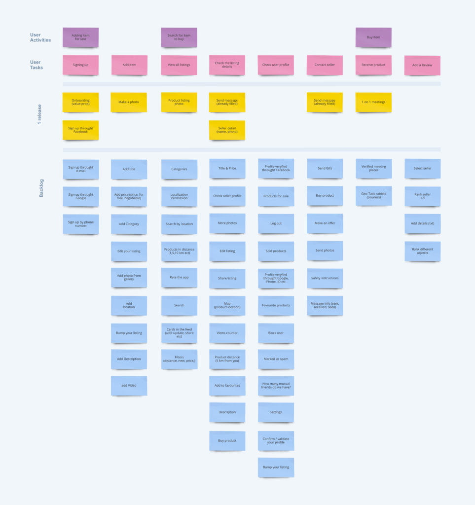
Below you can see our MVP – yellow sticky notes.
MVP & User story mapping
Releasing something into the world (in the early stage) is always exciting and a little scary at the same time.
However, it is the best way to test assumptions and get early feedback.
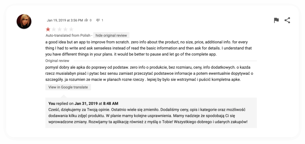
We got four 1-star reviews on Google Play. Below you can see one of them.
Review from Google Play console
Those four reviews were a little painful, but it was something we knew could have happened and it was fair. In MVP version you could add only one photo of your item (no ability to add title, description, category or more photos) so people had to send messages to each other and ask about everything – it’s understandable why they were upset.
There is no such thing as “bad feedback,” and to be honest, we were happy that somebody cared enough to let us know what was most important to them.
We had already prioritized the features mentioned in the reviews to be included in upcoming releases—those reviews further validated our roadmap.
During the first release, we were able to answer many key questions. Here are a few examples:
Cost of acquisition from Facebook & Google Ads (CPC, CPI, CP added products)
Conversion rate on app installs from Google Play & App Store
Conversion rate on registration within the app (e.g., Continue with Facebook)
Engagement inside the app (% of active users who visit items, add items, send messages)
User retention
After the first release, we learned that the app idea could actually work.
Each new release – Lean development
“If you can’t measure it, you can’t manage it”
Peter Drucker
We were crafting each release with the value that we were bringing to our users in mind.
Hypothesis – Assumptions – The way we were going to measure it.
Learn – Build – Measure loop.
We weren’t able to conduct an A/B test at that stage, but because we were doing it step by step, we were able to double-check each feature and make data-informed decisions.
We were tracking our core KPIs, and with each new release we were adding events to track new features. After a while, we started learning from the data we had been collecting.
The first few releases were focused on the core functionality, mostly on the basic features with high value for users (add titles, prices, categories, visit other user profiles, etc.).
After that, we were using the RICE method to prioritize each new release.
Below you can see what was shipped in the first six sprints.
First six sprints of development
3 pillars of great user experience
Based on research, competitive analysis, and our gut, we wanted to focus on these 3 core elements right from the get-go:
Flow of adding items for sale
Fostering trust
Product presentation
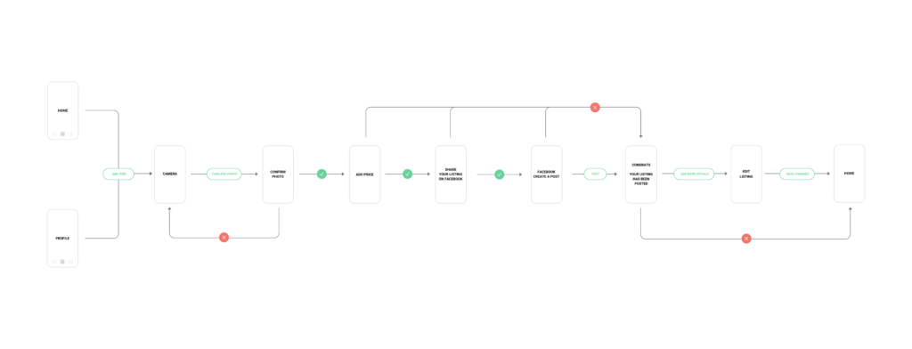
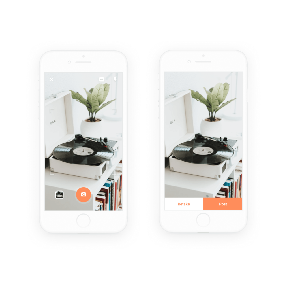
1st – Flow of adding items for sale
For users – adding products—something that takes a long time on other platforms—we wanted to make as fast as taking a photo.
For the platform – it was the answer to the question, “what came first, the chicken or the egg?” in the case of building a marketplace from scratch.
Also, in the Polish market, there were many products solving that problem, but none of them were mobile-only. It was not only about the platform—it was about how we believed this problem would be solved 5+ years from then.
Win–win. For users and for the platform.
There was one major insight about adding/posting products for sale online.
It came up in interviews and was also seen in the reviews of our competitors online—posting items for sale was time-consuming.
It took about 10–40 minutes to post an item.
This is what it looked like:
You had to find the item you wanted to sell (often it was at the bottom of your closet).
Sometimes (depending on the item), you had to clean it first to make it look good in photos.
You were ready to go online and create your listing. On most of the services in Poland, it was required to fill in all fields, such as Title, Description, Category (sometimes there were more fields depending on the category), and at least one photo.
So as you can see it was time consuming.
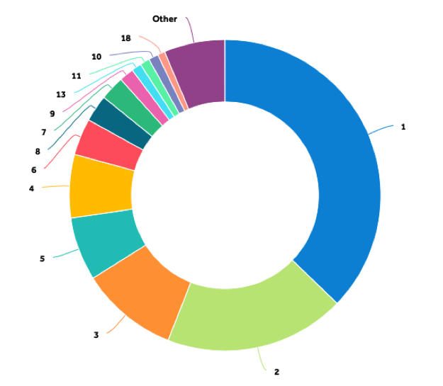
Also, based on our data 63% of people are adding 2 or more items to sell.
Added items composition
If you had more than one item for sale, you had to block even more time from your day to post all those products.
That’s why most of the time selling your unused stuff was tagged in your mind as “I will do it this weekend.”
We wanted to change that perception.
We eliminated unnecessary steps and broke the flow into small chunks—you didn’t have to do it all at once.
Don’t wait for a weekend – it’s so fast you can do it now!
There was a good piece of advice from James Clear’s Atomic Habits that applied here. The author was writing about taking small and incremental steps toward building a habit. He advised, “make it easy for yourself”—even though that sounded obvious, it wasn’t used so often. For example, if you wanted to build the habit of drinking water after waking up, you could just put the bottle next to your bed. Boom! You had already greatly increased your chances of drinking water as soon as you opened your eyes.
The same idea applied to adding your products for sale.
The most important step (the one that was moving the needle) should have been the easiest one.
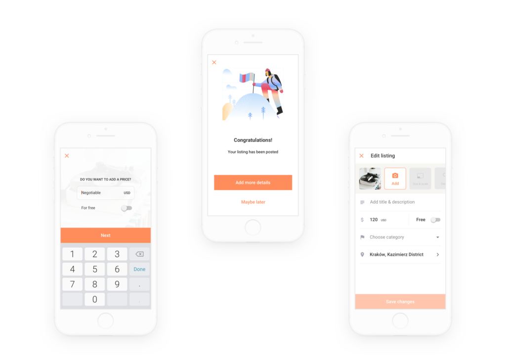
Want to increase your chances even more?
Share it with your friends (you just increased your chances by 20%)
Add more photos (15% increase)
Add the title & description (10% increase).
All of those things could be done later. The most important step was already made. Your listing was live for sale.
Easy way to enter the flow
Add an item button: this was the most important action in the app. The CTA was highly visible and easily accessible from every main screen of the app.
Number of steps in the flow
The balance between the number of added listings and the number of high-quality listings (with many great photos and well-described items) was the most important.
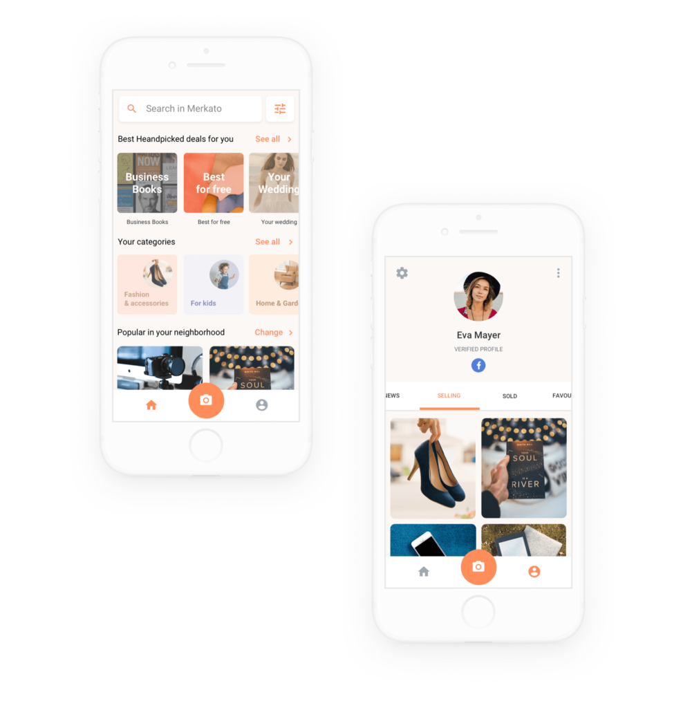
Add listing: selected screens
Above you can see some of the selected screens from Add listing flow. (awesome illustrations by icons 8)
2nd – Fostering trust between users
If you think about it, trust had always been, and still is, the biggest currency in trade.
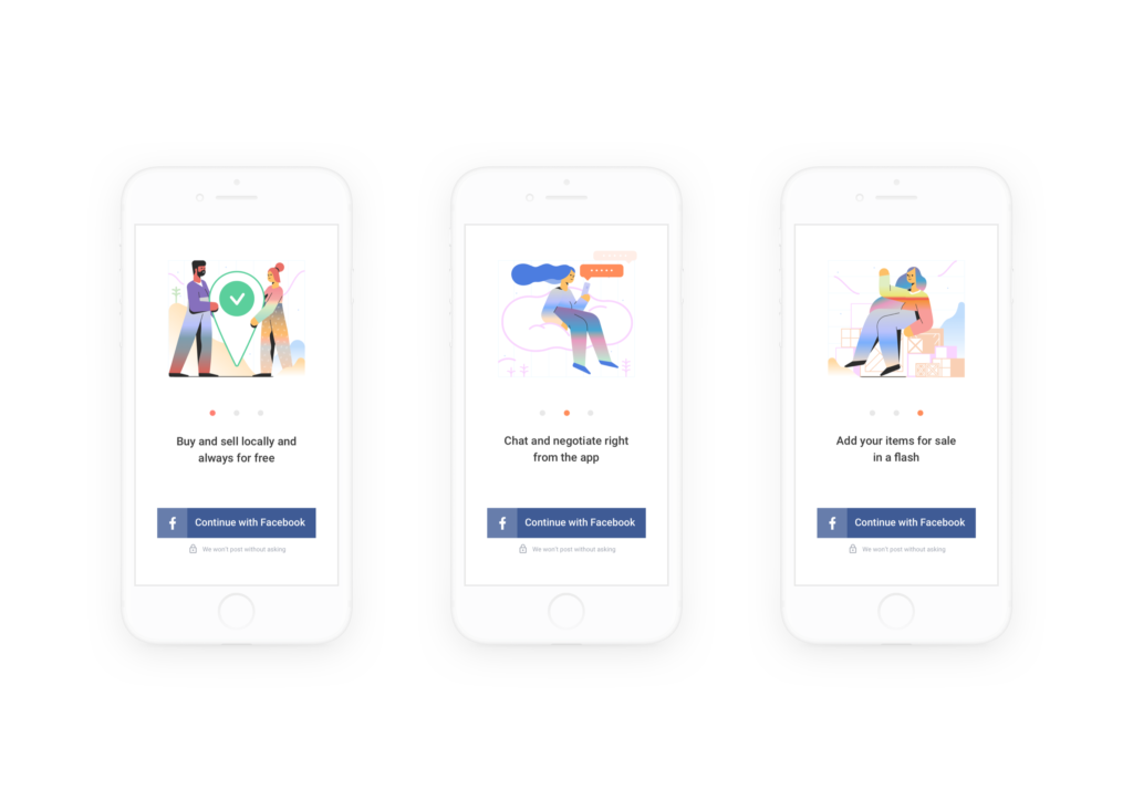
The most effective way to foster trust from the beginning was using Facebook to verify users. Facebook was the most popular social media platform in Poland, and we already used it to drive traffic to our app.
Main advantages:
Fast and easy registration (Continue with Facebook CTA)
Legit users and their profiles (real photos, real names)
Possibly lower % of spam and abuse from the beginning
Main elements to establish and foster trust:
Verified by Facebook sign in Profiles
Real names of the sellers and buyers
Large photos of sellers and buyers
Ability for instant contact
3rd – Mobie App & Product presentation
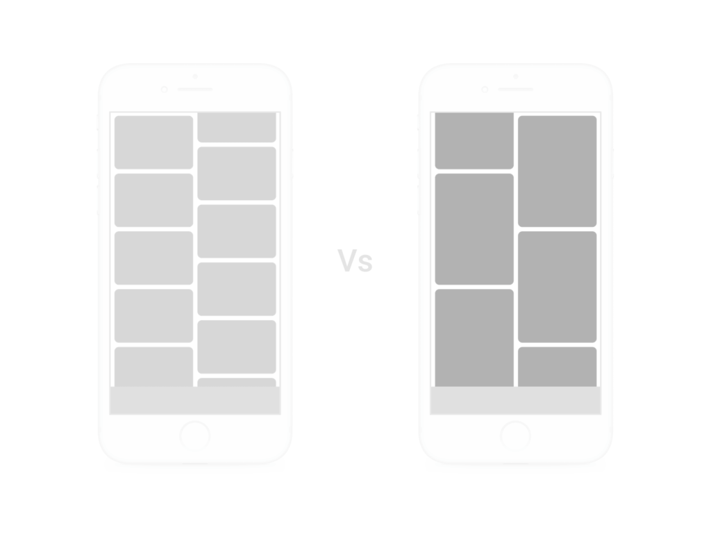
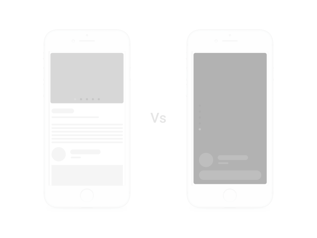
All competitor platforms in Poland were designed so that products were presented horizontally (on the feed and on the listing detail).
When you think about it, back in 2006, when they were designing those platforms, it made perfect sense—there was only desktop traffic. On January 9, 2007, the first iPhone was officially announced.
Since then, mobile phones had become more popular. Therefore, mobile apps were created to take advantage of the growing traffic from mobile devices—but the framework remained the same. They were designed with horizontal photo presentation as the default. Once again, it made perfect sense because their main traffic was still coming from desktop.
But the dynamic was changing, one mobile user at a time… By 2019, mobile was huge, and there was no going back.
Because we were creating a mobile platform we wanted to use that dynamic to our advantage.
Home screen – difference between horizontal and vertical.
Product detail – difference between horizontal and vertical.